2016年03月09日
New Gallery
My new house was completed. The prim limit is less than one tenth of that I was using before, but a gallery was included at the least.
Temi’s Gallery: http://maps.secondlife.com/secondlife/Publius/12/39/22

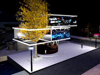
As usual, basic prims are piled up and textures are set. It is a bit shame to compare with many nice houses using elaborate sculpture and real texture.

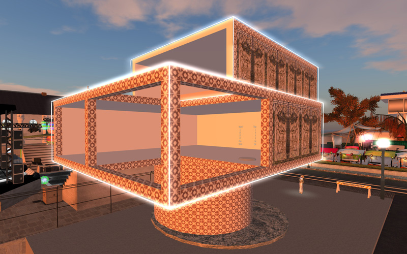
I will try various textures. Outlines of the building were illuminated, but it requires too many prims. Also the effect was not so good.
Minimal furniture was set. My old bed and bath had more than 200 animations, but regretfully they need too many prims. The gallery is on the second floor. I will covertly put some pictures that are not suitable for this blog. The first theme is CPR.

Temi’s Gallery: http://maps.secondlife.com/secondlife/Publius/12/39/22

As usual, basic prims are piled up and textures are set. It is a bit shame to compare with many nice houses using elaborate sculpture and real texture.

I will try various textures. Outlines of the building were illuminated, but it requires too many prims. Also the effect was not so good.

Minimal furniture was set. My old bed and bath had more than 200 animations, but regretfully they need too many prims. The gallery is on the second floor. I will covertly put some pictures that are not suitable for this blog. The first theme is CPR.

Posted by Temi Oyen at 06:05│Comments(0)
│Temis Gallery
